(Re)building QLEAR.io
OVERVIEW
Operating in a fairly uncluttered space, QLEAR has poised itself as a forerunner in empowering organizations to create healthy and sustainable spaces. As their in-house Product Designer, I was responsible for the end-to-end design process in reimagining their next generation platform.
TIMELINE
12 months
ROLE
Product Designer
METHODS & TOOLS
Comparative Analysis, User Interviews, User Surveys, Use Cases, Site Map, User Stories, Mood Board, Paper Wireframes, User Testing, Sketch, InVision, Principle
PROJECT BACKGROUND
When I joined this company, the product was very much in it’s “MVP” state; bootstrapped by a small team in order to launch quick to market. The product’s sole purpose was to provide data analytics for indoor air quality. But, there was a need to grow and expand.
PROBLEM
One of the major business goals was to include data for other aspects that make up a comprehensive understanding of commercial building space management, including energy (power), sound, lighting, and more. In order to accomplish this, the product needed to grow, and the existing design was shoe-horned specifically just for air data only.
OPPORTUNITY
With so many variables across energy, sound, lighting, and other forms of metrics, how were we going to design a all-in-one platform that could handle and support so many complex functions of information, and how would we visualize this? Thus the complete redesign of our system was necessary.
RESEARCH
The state of the product
What is QLEAR? QLEAR’s platform provides an easy way to manage your building’s environmental data. As an integrated indoor environmental quality (IEQ) management system, data is collected, organized, and analyzed in real-time from air quality, electricity and other readily available data sources.
During my first few weeks on board, as part of improving the overall system in user-friendliness, I conducted various methods of user research in order to find pain points. The state of the product was in dire need of support. Users required a lot of training and hand-holding to get started, even those that were subject matter experts. Several users were “hacking” their way of setting up workspaces/locations due to the way the product was initially built (without consideration of scaling). A primitive model was used that read data from hardware sources directly, which prevented us from scaling for multiple data types, stronger support for data manipulation, and complex customization. And perhaps the icing on the cake, was that the entire product was just lacking “eye-candy”.
The Business Need
The MVP was pretty straightforward - we had one product that was taking data from hardware monitoring devices, which captures information such as PM2.5, PM10, CO2, and several other parameters of the air around it. Soon though, more complicated systems such as SCADA, or in general, BMS (Building Management Systems), were being used by several high-spend customers, and we needed to adjust our MVP product to better support their needs.
The Process
Our team was quite young - we originally were a product of GIGA , but the product and it’s team needed to split off to accommodate for a growing demand in the software being vendor agnostic, and thus a small team of 6 was bootstrapped together, along with the MVP product, for roughly half a year before my arrival. With such a small and intimate team, I worked very closely and directly with my Product Manager, Front-End and Back-End Developers, and our QA Support. I fit into their bi-weekly Agile sprints, while introducing my own design process within:
PLANNING
Building an experience for the users
Due to the organization structure, two of the co-founders that held a stake in the company operated their own environmental solutions company that represented the initial user base. Due to this intimate relationship, I was sable to leverage that to speak to some power users using QLEAR on a day to day basis to get first hand feedback about the product. Clients included JLL, PureLiving, and BEE.
I paid a visit to their offices and sat with several users to listen to their pain points, goals, and motivations. From doing so, I uncovered a lot of valuable feedback and shortcomings. I consolidated and organized all my findings via an affinity diagram at first.
Feature Brainstorming + Prioritization
Through the affinity diagram, I was able to further sort the feedback into clusters of topics, uncovering issues surrounding information architecture, lack of understanding in user expectations, mis-alignment with user goals, and a high learning curve for users. So, together with the Product Manager, we sifted through all user feedback and engaged in a “blue sky thinking” brainstorming exercise to come up with features and ideas that would address these issues, sorting them into an Effort vs Impact matrix.
Needless to say, we had a lot of topics to tackle. For the sake of this case study, I’ll focus on the following:
Onboarding
Taxonomy & Information Architecture
New data manipulation paradigm
DESIGN, PROTOTYPE, TEST
Taxonomy & Information Architecture
Another key pain point uncovered in user research was the information architecture and taxonomy. Some of these naming conventions were driven by business needs, as the current hierarchy was also not easily scalable for large corporations that we were building to support with many layers of teams and permissions.
Referencing the user interview notes from earlier, here are some notable pain points expressed during the interview process:
“What’s the difference between a location and a workspace?”
“Location” was being misunderstood as the physical location of where the monitors/data sources were located…
“My monitor” vs “Hardware” - labeling discrepancy
“Device” text label was confusing
“Identifier” label was confusing
“Indicator” label was confusing
“Station” is confusing
“What is a Station? :(“
Based on all this feedback from users, it was clear that everything was confusing, which was rooted into the many pain points that our users felt. To solve this, I uncovered the expected input from product and development teams, and gave a first cut for renaming our encyclopedia of terms.
We also iterated several times on the naming of the controversial “station”. “Zone” was my initial suggestion - similar to alarm zones in a home. The analogy worked well, except in future-proofing, we needed to consider situations where users may need to set up a collection of indicators that spanned multiple floors, or a complex layout, or complex data types that didn’t really make sense in a “zoning” sense. Hence, “Collection” was the name we decided on. We would go on to iterate a few times on the naming convention throughout the course of the redesign effort, concurrent with rolling out design updates, bug fixes, and features.
Now, let’s take a look at another important part of the experience defined by taxonomy and information architecture - filtering and sorting Locations.
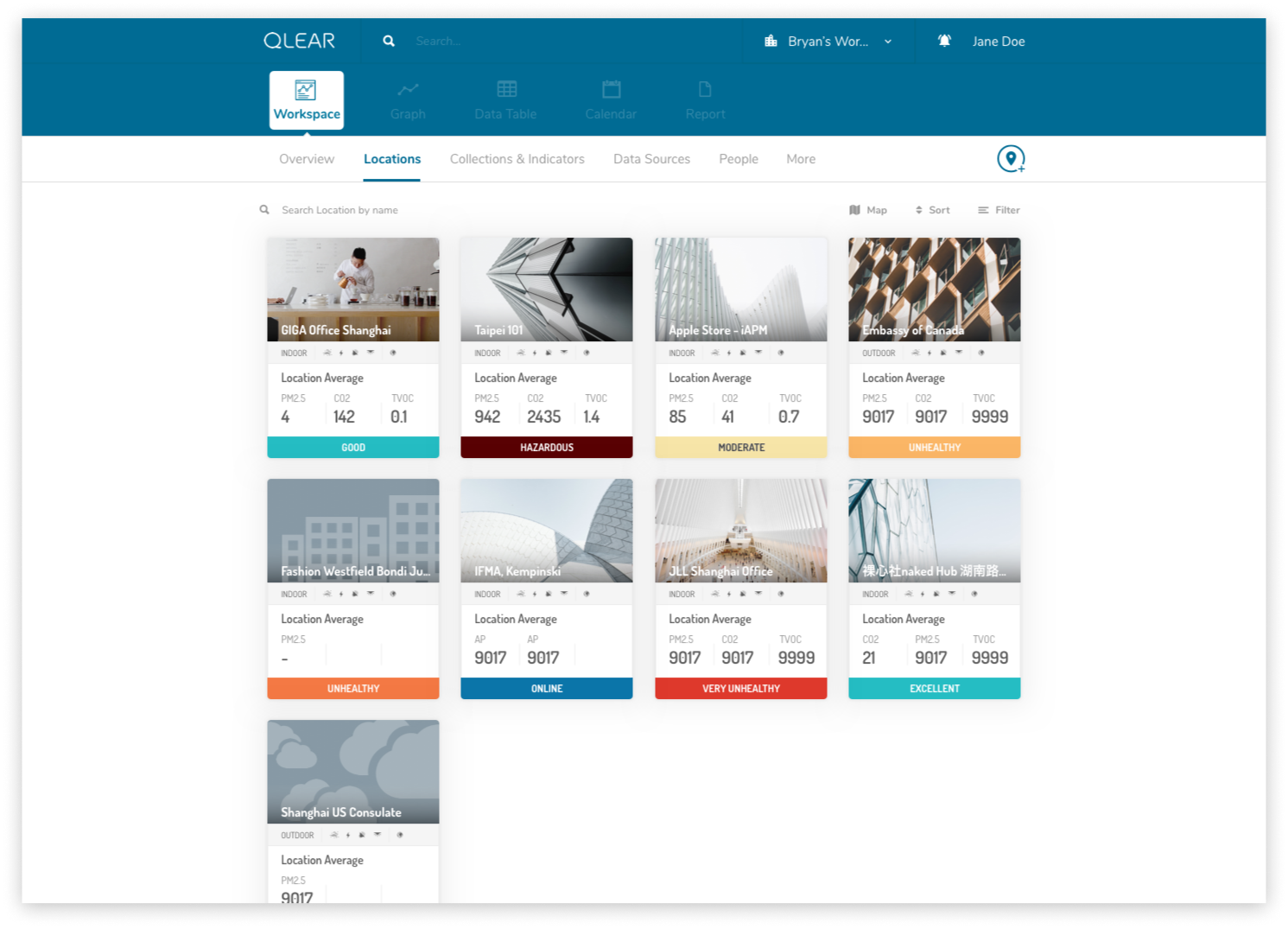
Location is the visual and virtual representation of a space. Locations allow you to set up the space and include the relevant monitors for the space to organize and calculate the information to be displayed in data tables and graphs. Locations must belong to a Workspace.
A Location is comprised of a series of monitoring stations.
Without hardware or monitors attached to your Location, the location will be an empty shell with no data.
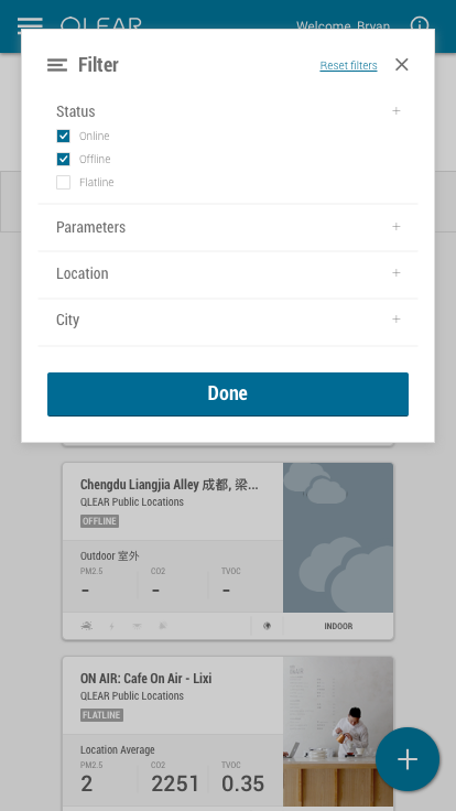
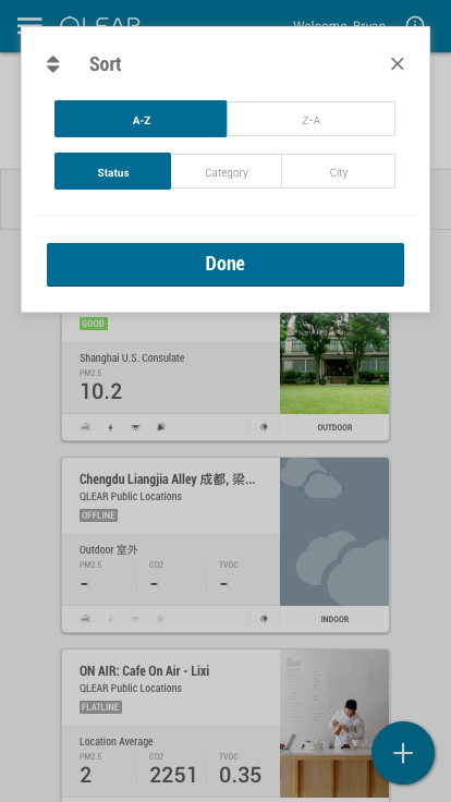
For our core user group who were environmental solutions consultants, it was not unusual for them to be managing dozens of clients spaces, some with several dozens of locations set up. Filtering and Sorting was a critical feature necessary to increase productivity. Here’s what Locations looked like in legacy:
Each location was represented in a tile or card-like interface, containing core reading data, it’s air quality rating, amongst other details. One of common shortcomings was the lexicon that was being used in representing the metadata of each Location, and the feedback from our users was loud and clear: the labels/namings we were giving to certain data properties meant different things to different people, causing confusion amongst users. Locations have many properties, and displaying these many properties to users in a universally coherent way was the challenge.
Rebooting the lexicon meant finding out how we were going to organize, group or label certain ideas based on how users understand those concepts. Filter & sorting was previously unavailable, so we were introducing it for the first time to our users. From a product perspective, we knew each of the properties that define a Location. In order to validate our understanding, I first asked two users to complete an open card sort of the following topics. Here were their results:
At the time, I was only able to get data from two users due to resource limitation. I needed a little more user-driven data to work with, so I tried a second exercise; I opted for a similar approach to the closed card sort, except instead of pre-determining categories, I had the groupings pre-determined, and asked users to come up with a category name that made the most sense to them.
Results showed several keywords that continually registered with our users. Balancing our user’s understanding of concepts, I considered the needs of the business and made the final decision on naming conventions to optimize for sorting & filtering. This was the outcome and implementation of sorting and filtering:
As part of this feature buildout, I also re-skinned the UI components of the location tile/cards in order to give it better readability, and overall more friendly on the eyes.
Onboarding
Let’s talk about onboarding. Pretty high on the fix-priority, it was clear that this was a big pain to users - it was a recurring theme during the user interviews and surveys we performed. One issue was that the core action panel was a “floating action button” denoted using a + symbol. It was not clear to users what this icon represented nor that there were critical functions hidden behind it.
Actually, during that first affinity diagram activity, we quickly sprung into a little bit of a pre-planning mode because the issue of first time experience and onboarding was so prominent. It was messy, but here was what that battlefield looked like:
A lot is happening on this whiteboard. But to break it down, questions that came up from our users during interviews included:
How do you connect the location with hardware?
Why do newly created locations immediately display “stale” status?
Why do I need to set up stations? What even is a station? :(
After explaining to our user the hierarchal structure, taxonomy, the workflow in setting up workspaces, locations, hardware, and stations, our user provided us some valuable insights in how she would want to be asked in providing this info, what makes sense and doesn’t make sense, and crafted an onboarding experience that would resolve these pain points. After iterating a few times to address the underlying issues, this was the flow I ended up with:
The key here was leveraging an appropriate amount of progressive disclosure, while re-categorizing the types of questions we were asking, ensuring that we were only presenting these questions to the user at the correct time and appropriate context during the onboarding flow.
Here is what the first cut of the FTE looked like:
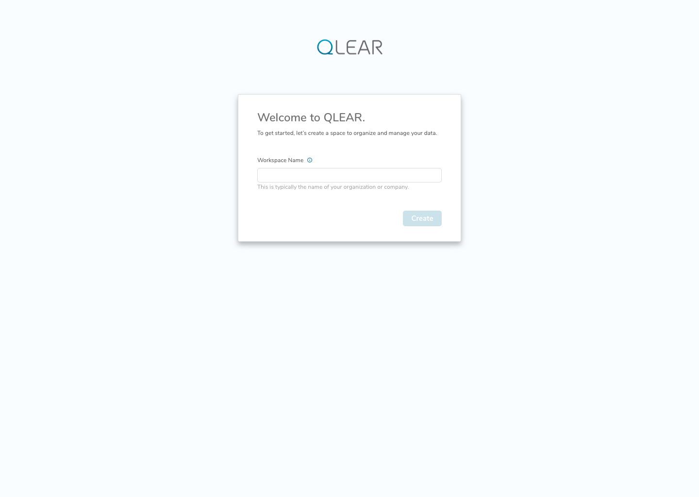
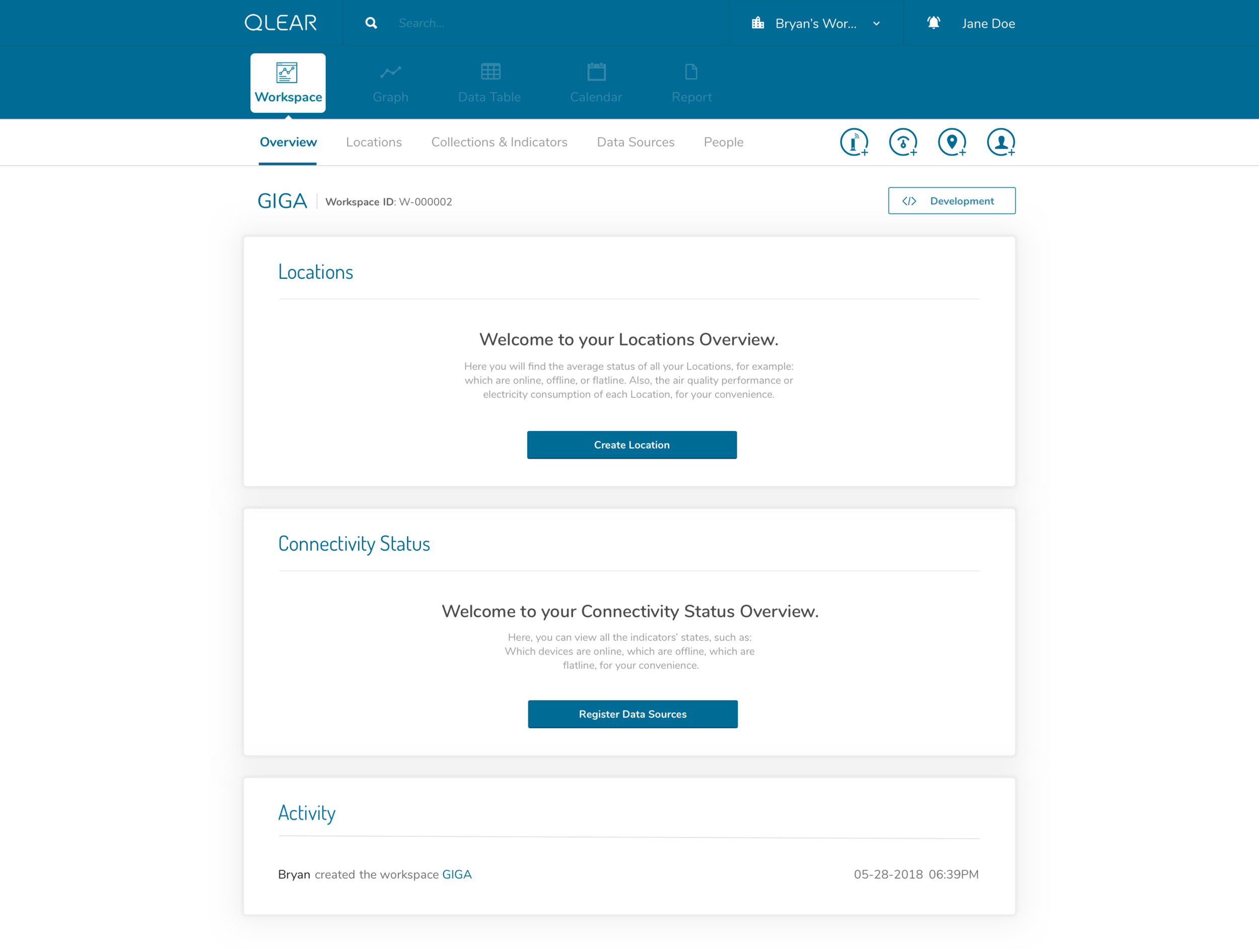
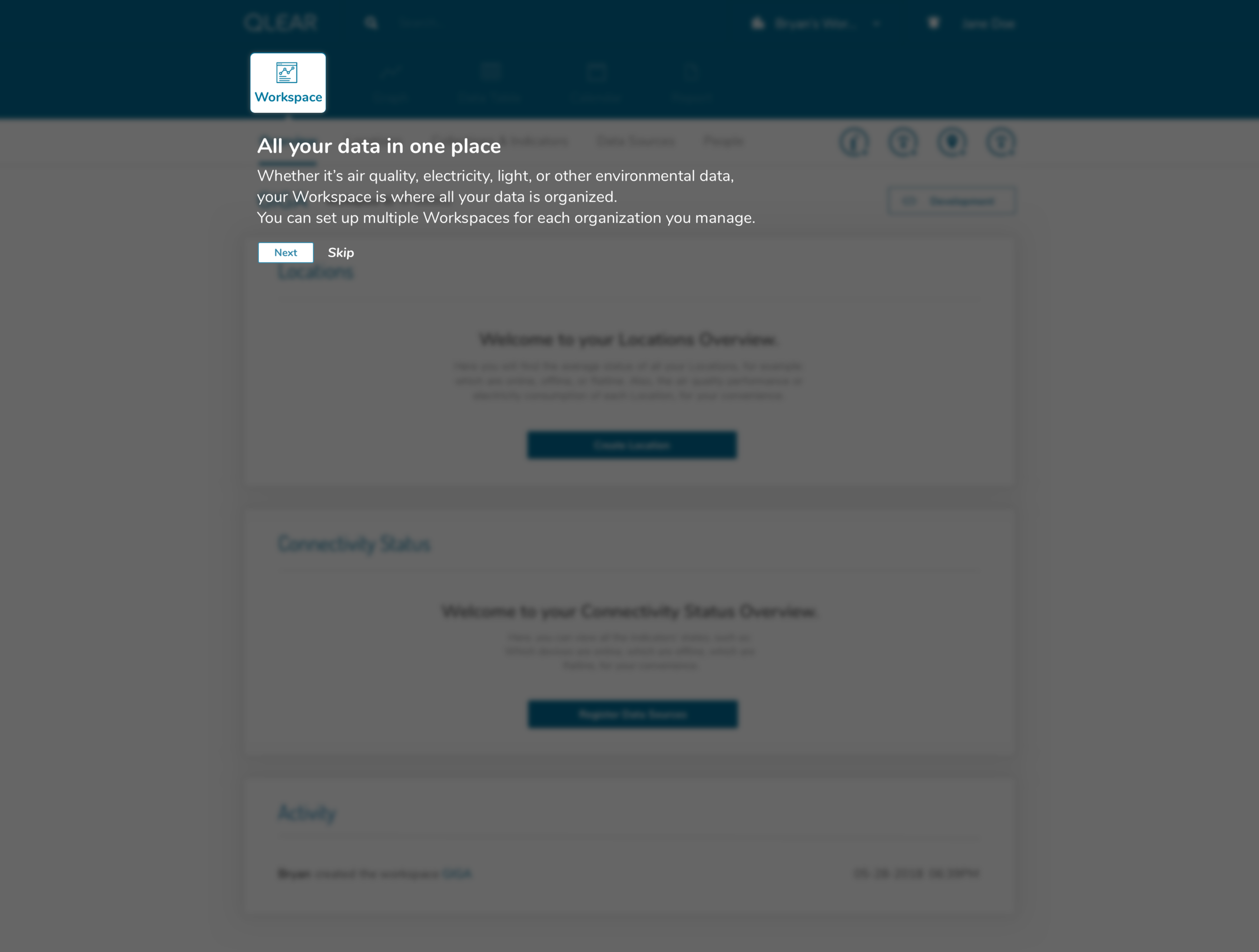
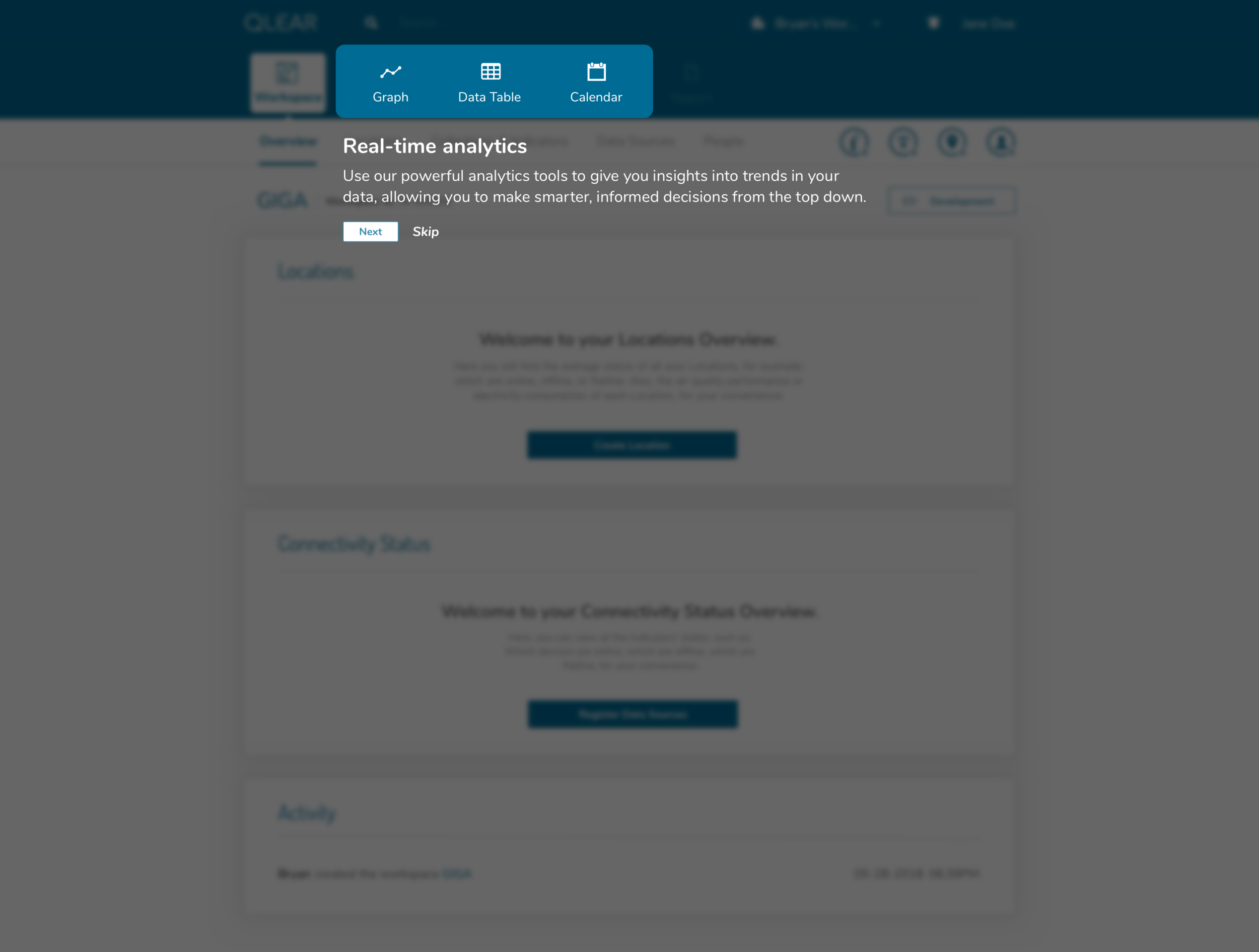
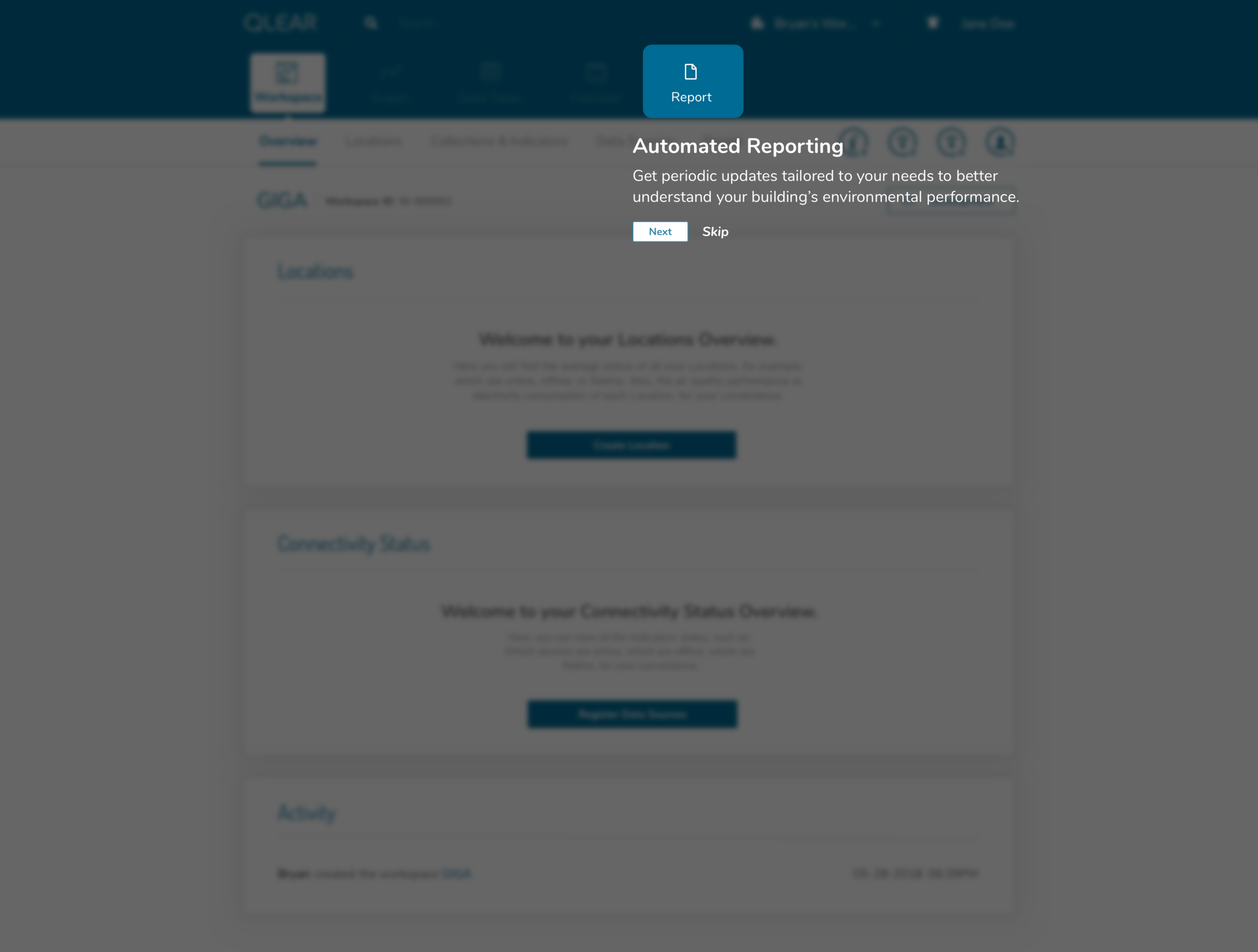
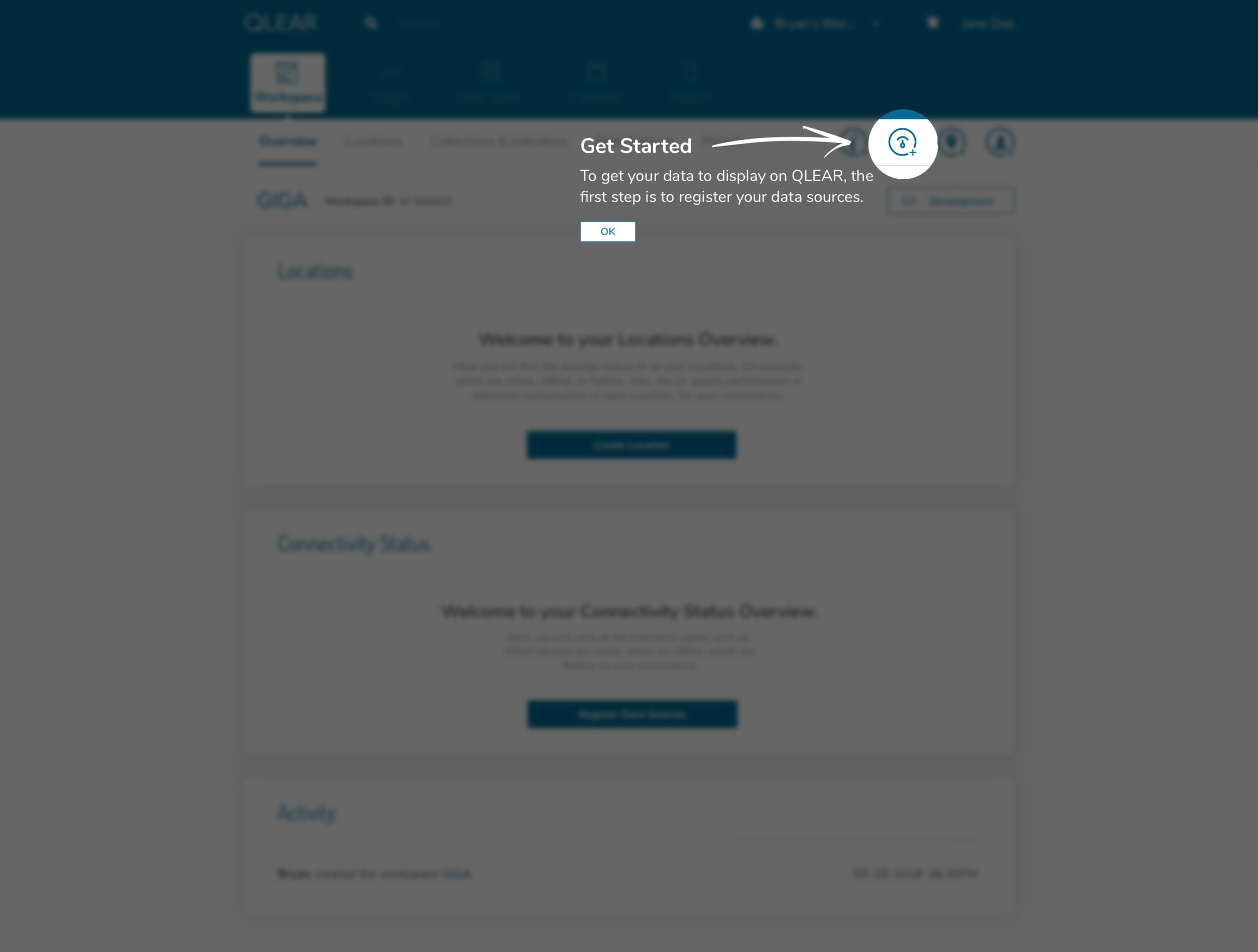
In following this brief tutorial, the user is then directed to their first necessary action, which is to add data sources. This resolves the issue previously where users were felt lost after completing the creation of their workspace, due to a lack of direction, and many key/critical features buried in a FAB button. Intentional design decisions were made here to get rid of that FAB button and expose calls to actions that the user should care about in order to get value out of the product.
Continuing with the onboarding experience, here’s what the registration of data sources looks like:
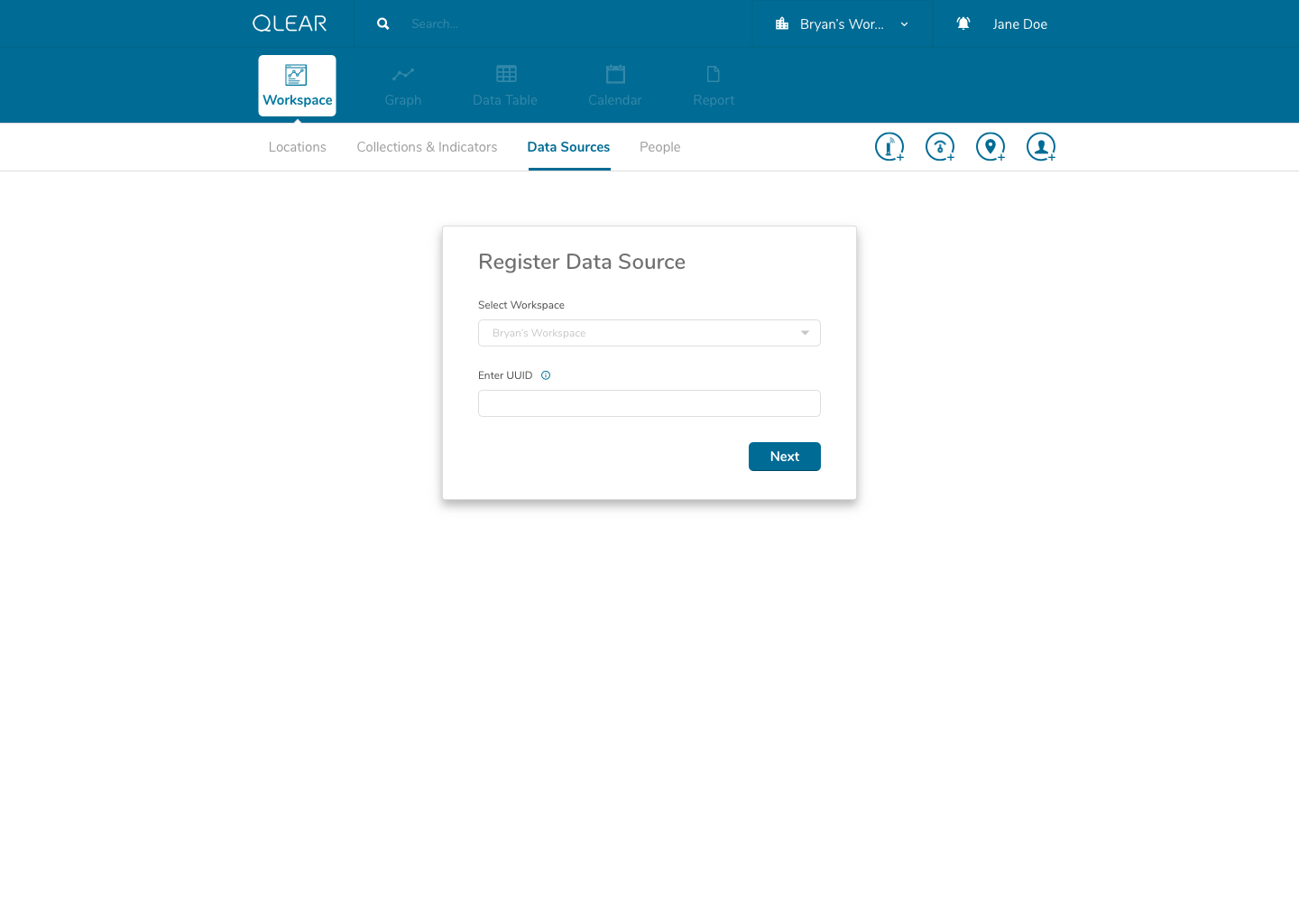
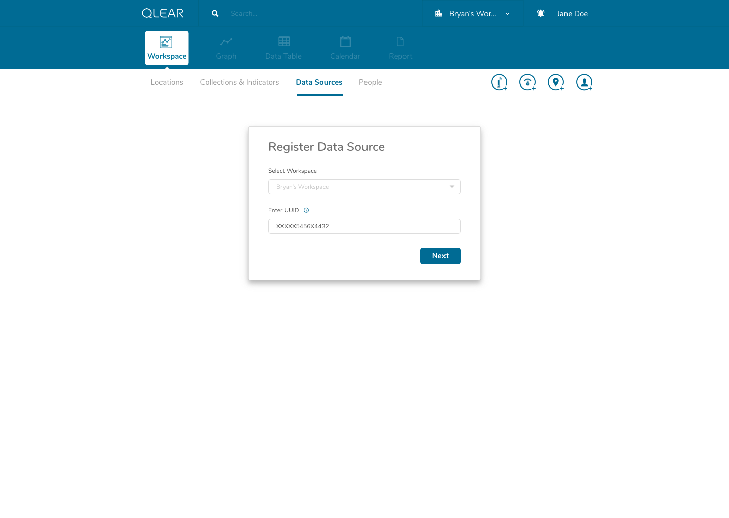
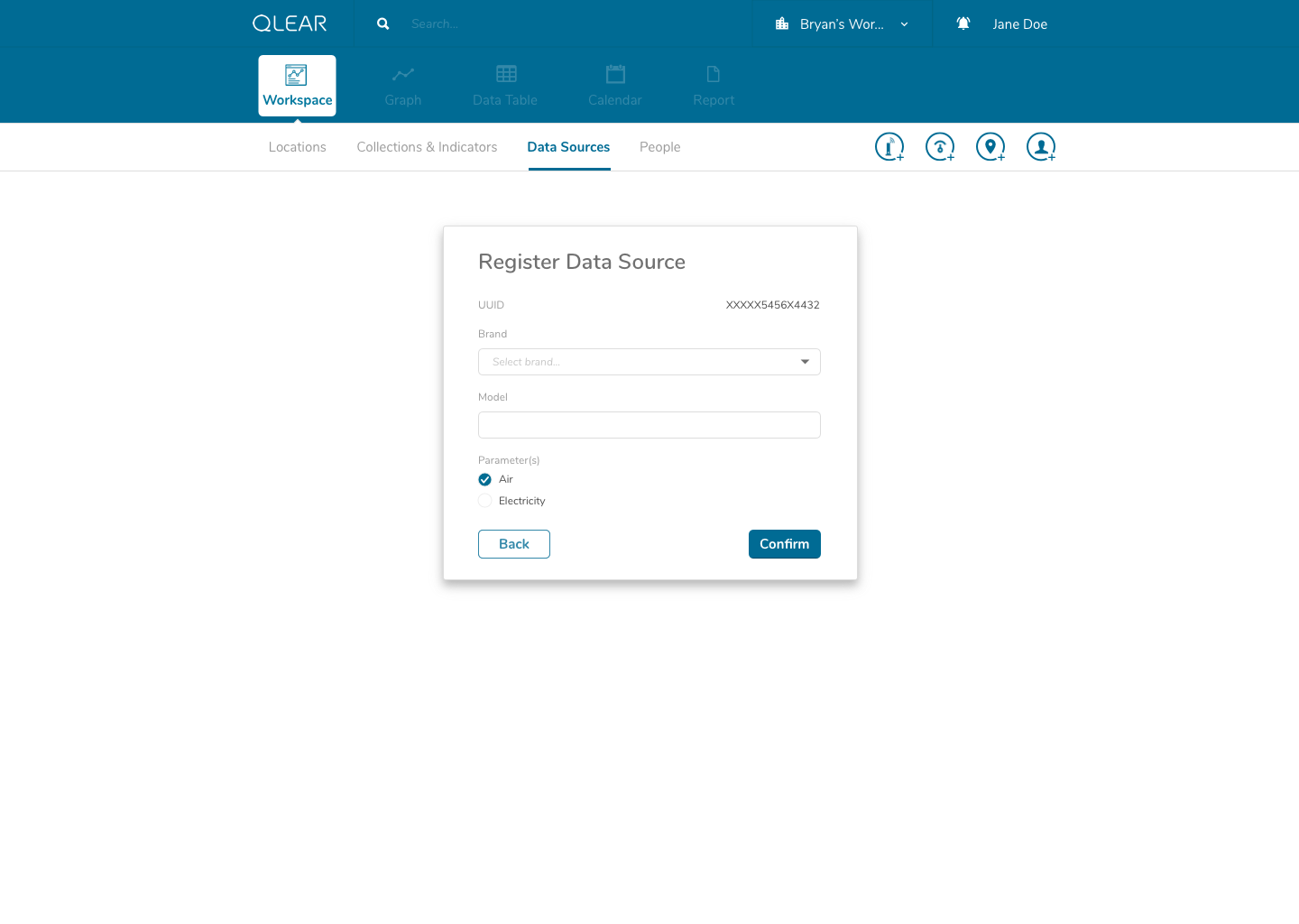
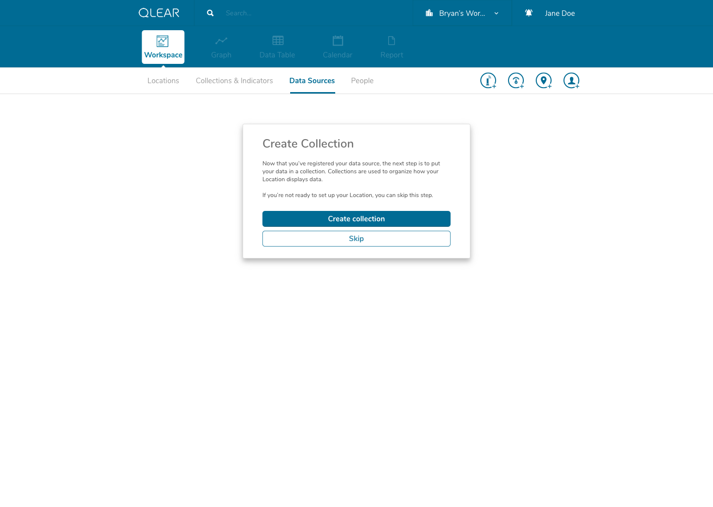
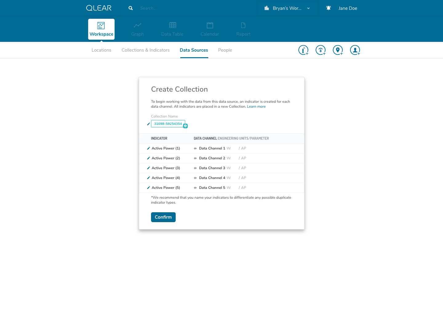
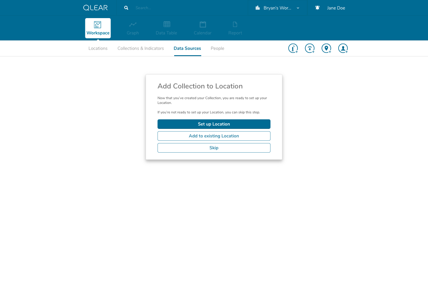
As outlined briefly in the user flow above, data sources would be automatically detected once the user enters the UUID. I had intentionally added a helper on the input screen to support users understanding in identifying the UUID number found on their data source/hardware devices. Our back-end system would essentially have an index of UUID’s to detect the brand/make/model, essentially expediting and relieving the user of the need to specify tricky details. In the event that a user entered an UUID not sanctioned by us, a “manual” mode would be available. This is similar to a credit card payment form, where by entering the first four digits of your card number allows the system to automatically detect what type of card you are entering.
Once a user completes that process, we prompt the user to jump straight into the next set of steps to ensure their success: setting up a collection. A similar process occurs once the user completes configuring their collection; we prompt the user to then jump into the set of steps afterwards: setting up a location.
Putting this design in front of the same users that provided us with the insights, all of them found the process to be much easier to follow. This design approach would also be friendly for power/repeat users by design, in my inclusion of drop-off points for users that are setting up data sources/collections/locations in a bulk task, for example.
New data manipulation paradigm
I mentioned in the project overview that I was responsible for driving the product design of their next generation product, and one of the keys to taking the product to the next level was to introduce a two fold paradigm shift.
Enhancing the existing CRUD system model
Switching from a “location-driven” approach of consuming data, to a “tool-driven” approach to consuming data.
The enhanced CRUD system model was actually somewhat highlighted in the earlier explanation of the onboarding process, but it is a significantly complex task. It required us to shift from the previous model of reading directly from a data source, to reading from a virtual parameter, that was pointing to a data source - quite similar to object-oriented programming, and the concept of creating a “pointer”. This was incredibly important in order to scale; it allowed retainment of user data in the event of hardware failures, increased reliability, and better support for data streams, amongst a plethora of other features.
While this was largely a product driven feature, we had a beta version of “power” parameters set up for select live customers using a one-off purpose built platform leveraging the existing CRUD model. Here’s a walk through of an early iteration of the revised CRUD model:
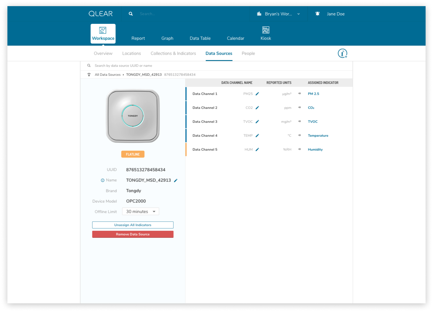
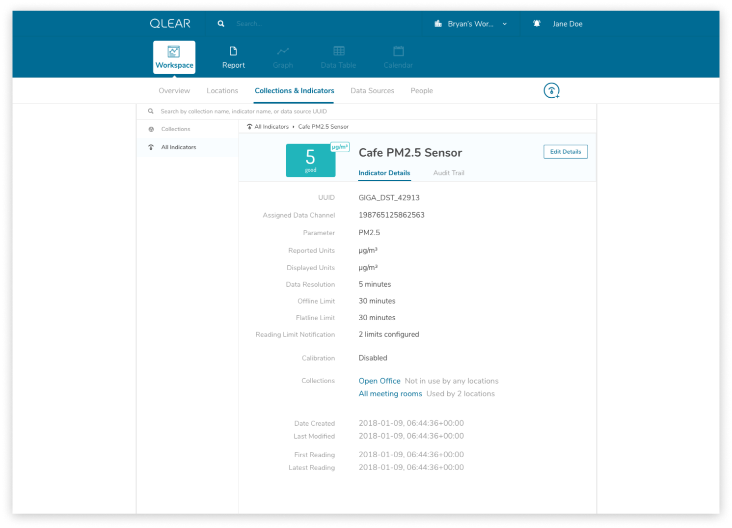
The shift for users was essentially inserting the extra layer in between their data source, and being able to see the data appear on QLEAR. The introduction of “virtual indicators”, or simply “indicators”, meant that an extra step was being introduced into the configuration process. For many users, this extra step may not make sense. Where it does make sense, was in the application of Energy.
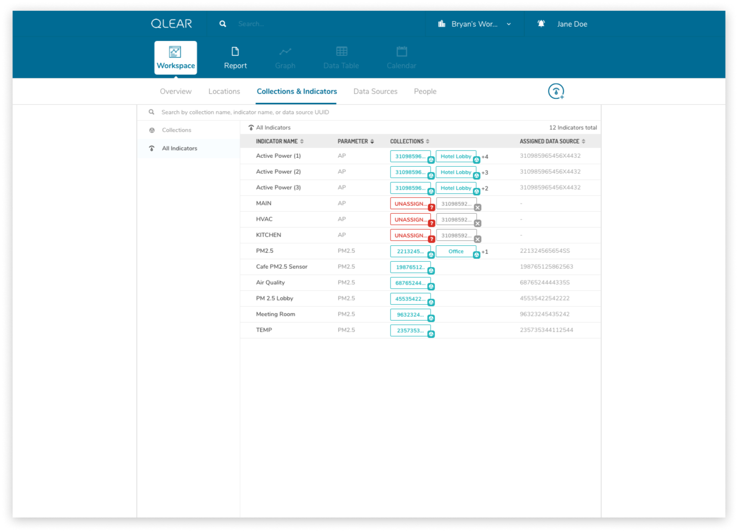
As an example, consider how a BMS may monitor, store, and collect air quality data parameters and also energy data parameters. However, In the case of energy data parameters, a building may have dozens of circuits that carry a reading. The analogy here is to think of a breaker - you have one line controlling kitchen power, one for HVAC, etc. But unlike air quality readings where parameters are typically unique (PM2.5, PM10, CO2, TVOC, etc), electricity readings all register the same type of units - Active Power. Using the primitive/MVP CRUD model, these data channels would be plugged in to QLEAR’s API, but there would be no way to allow the user to differentiate what reading belonged to which data channel, without some way to customize it. It gets even more complicated, when you consider the need to take in an reading for a circuit arranged in a series, or when you want to add up the total energy readings from several data channels and have them feed in to QLEAR as if it was just one source of data (like “Total Energy Usage - 1st Floor”). The possibilities really are endless!
But as complex as this could become, we still needed to design with careful consideration that a large number of users would not need this level of complexity, as small organizations may simply just use several off-the-shelf air quality monitors. The challenge was, how can we design the platform to be easy and simple to use but smart and flexible for power users?
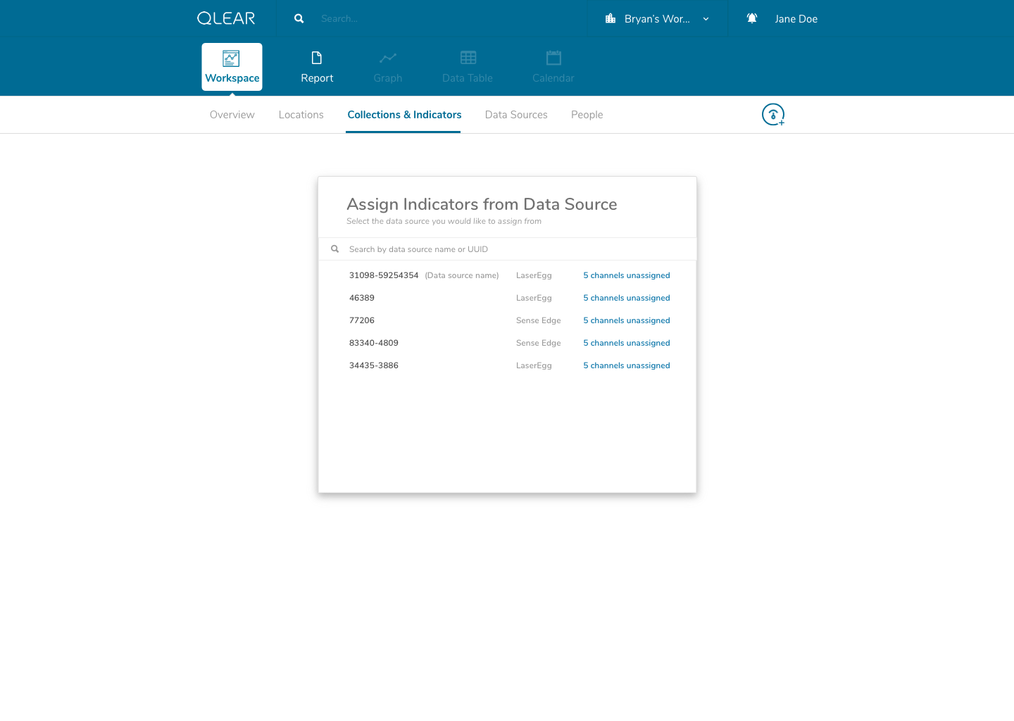
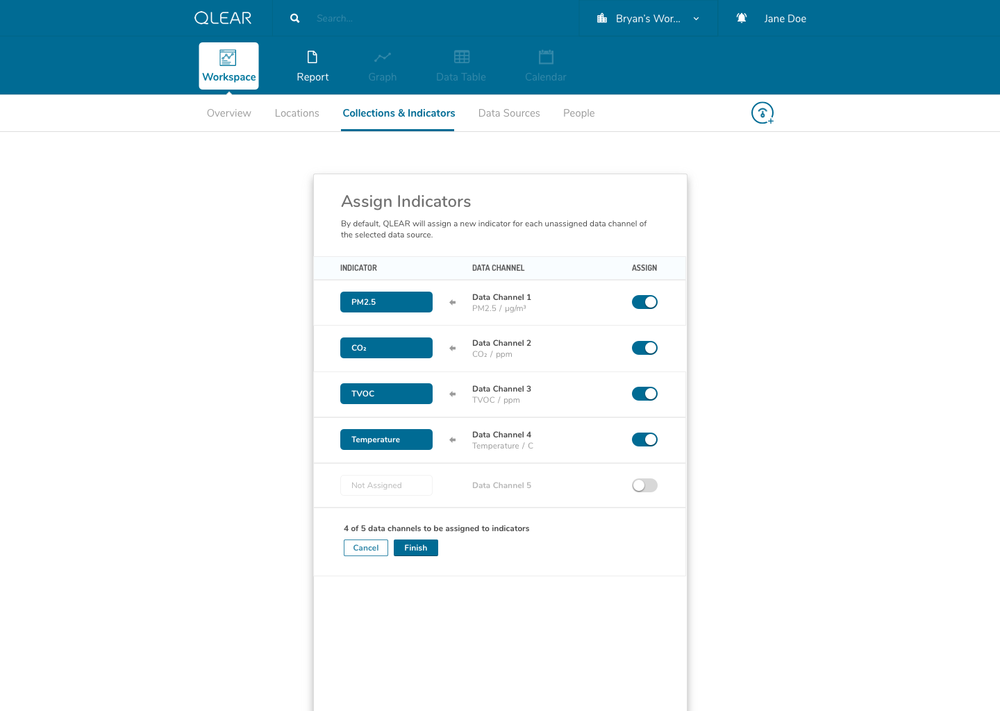
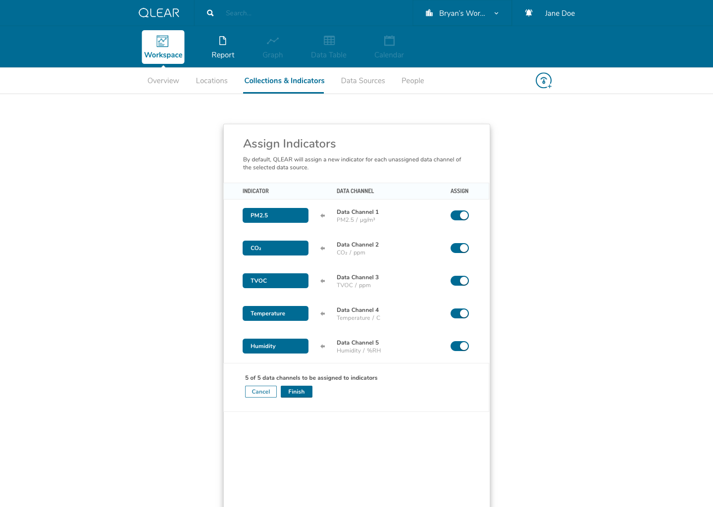
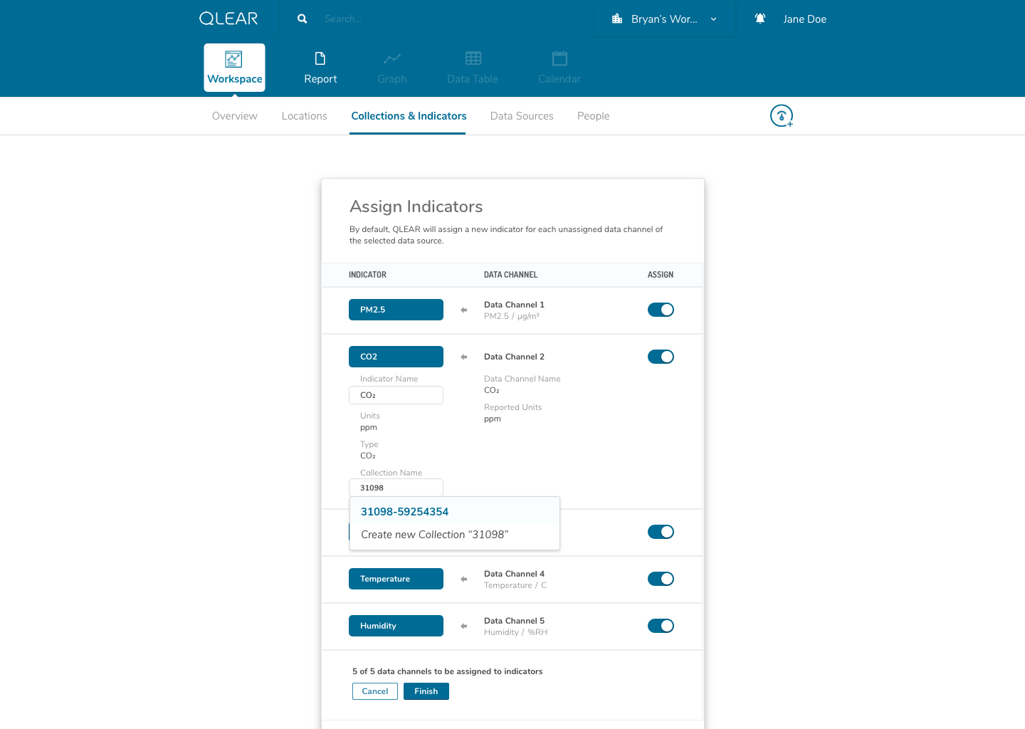
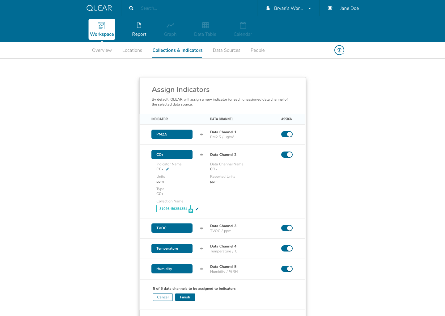
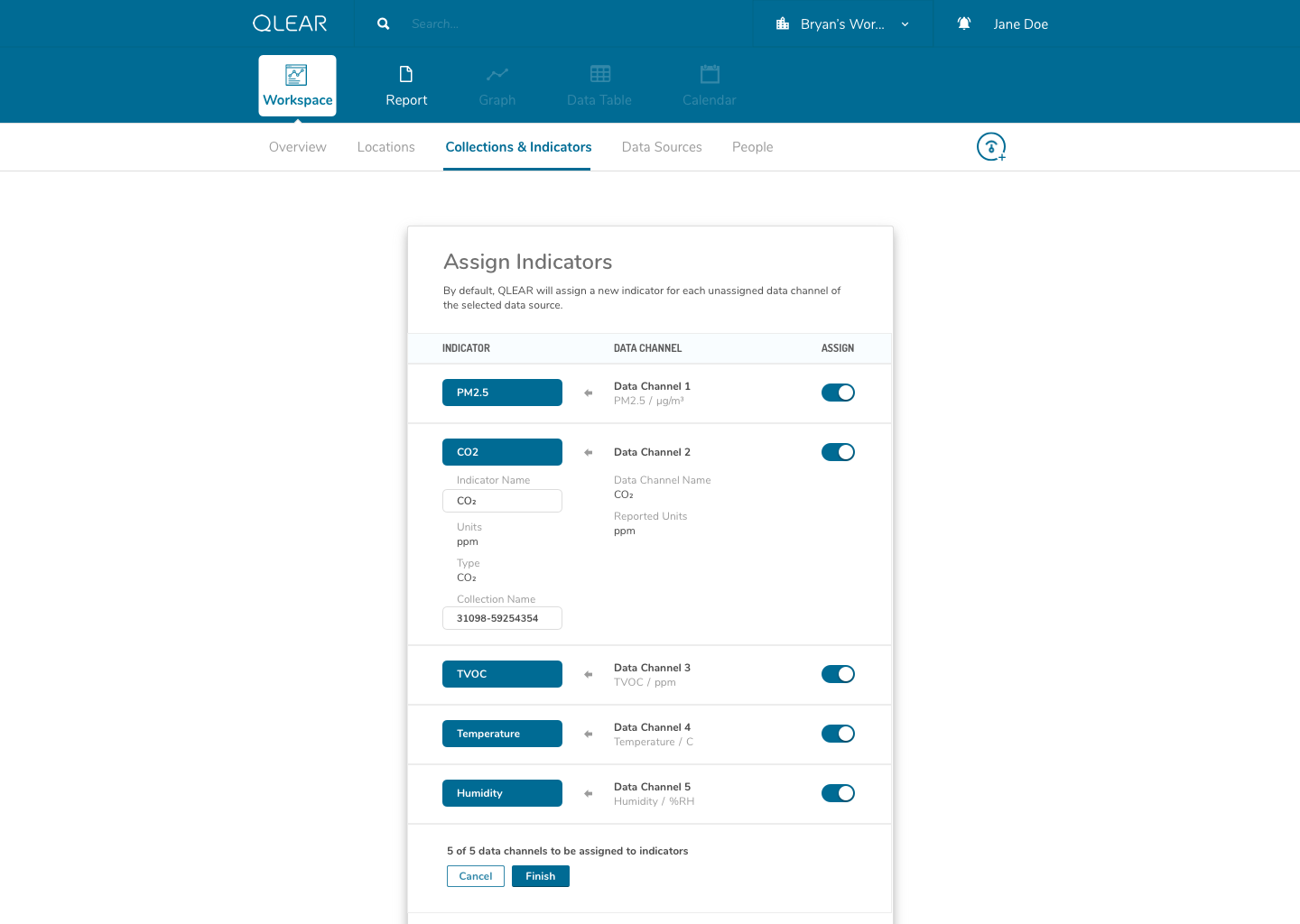
This concept actually took me quite a while to fully wrap around my head as well. The solution in making this as painless as possible for users of all knowledge levels, was the combination of a simple, concise onboarding and FTE, and catching the user at every point of their experience journey to ensure that they haven’t forgotten a process or a step.
One thing that helped me understand the notion of having to first “map” data channels to virtual indicators was drawing them out literally like a circuit board. My designs reflected this visual expression of relationship between two concepts, as you can see in the above mockups. I didn’t go as far as leveraging skeuomorphic elements in my design, but being able to visually see where data was being linked visually was key.
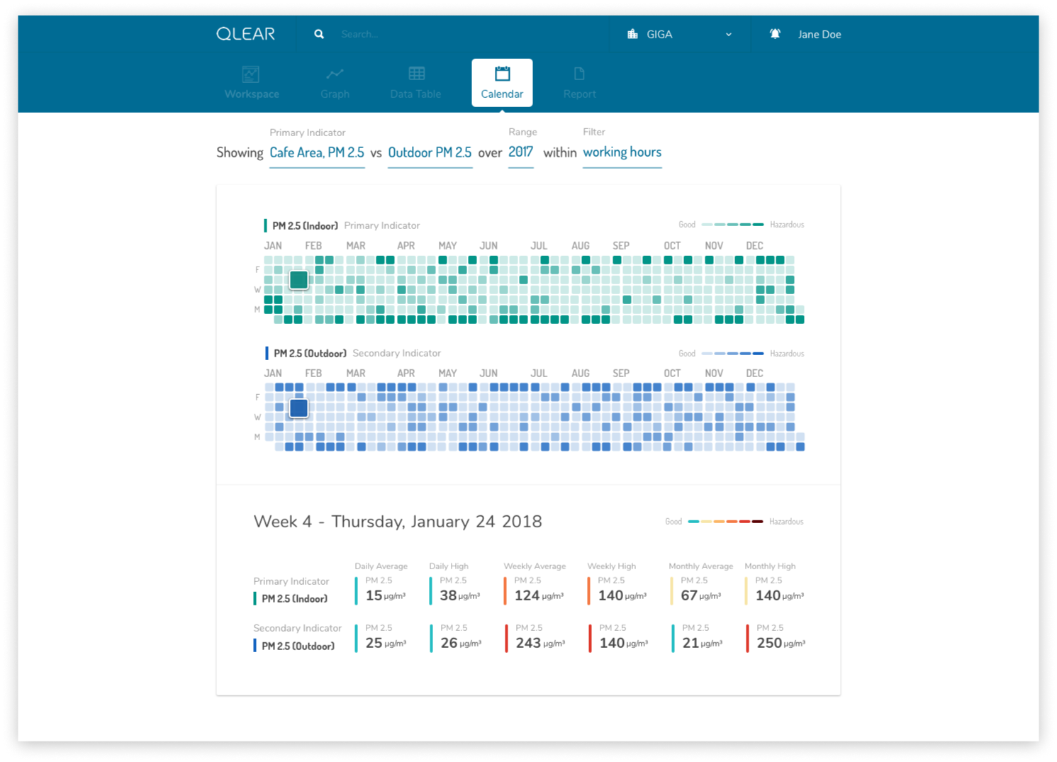
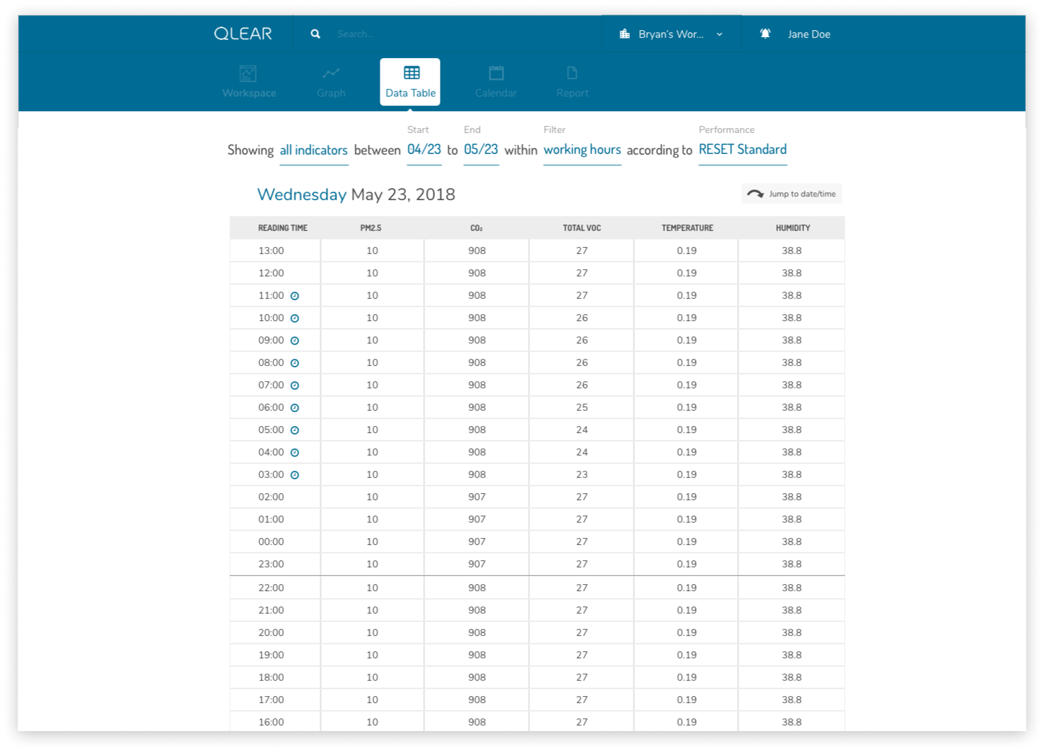
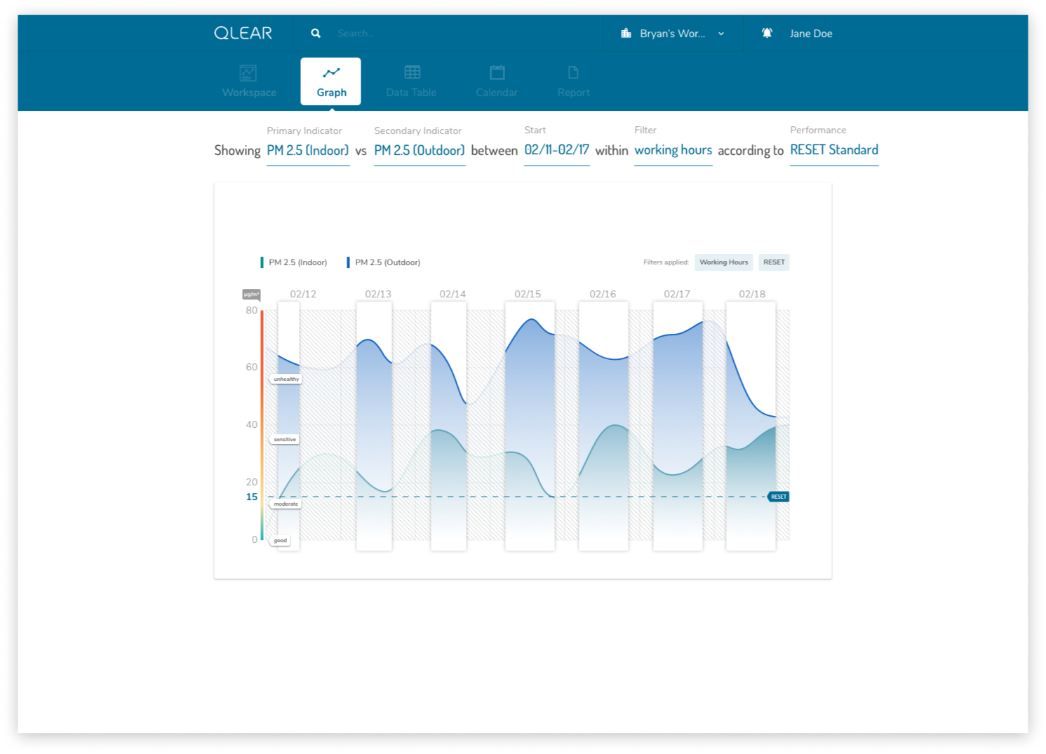
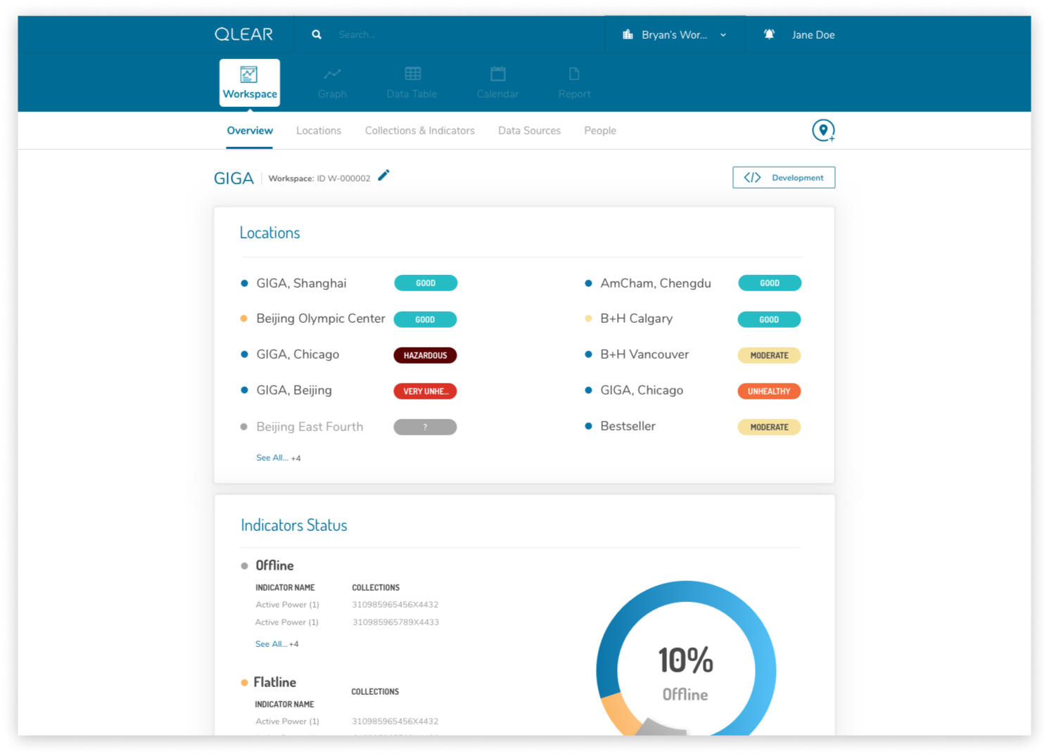
The second part of bringing the product into it’s “next generation” phase was to disassociate the anchor of data to a workspace or location. This approach allows users to jump between different indicators and data sets much quicker without having to backtrack in navigation back and forth to other locations or collections. Parameters that are defined by the user are also carried over between tools, so when the user switches from “Graph Tool” to “Calendar Tool”, the indicators and conditions are all saved, making the consumption experience much more fluid and immediate. This user flow chart below compares between the BEFORE and AFTER:
In embodying the concept of approachability, I wanted the design to feel as human as possible. An intentional design choice I made was to request for conditions and parameters from the user using natural language, as opposed to a series of dropdowns and boxes. The benefit of this implementation is that it also logically guides the user through the chronological bits of information that would be necessary to display the information they are looking for, even if they don’t know what exactly they want to reference their data against. I stressed the notion of really breaking down the complexity of data manipulation into a one-step-at-a-time model.
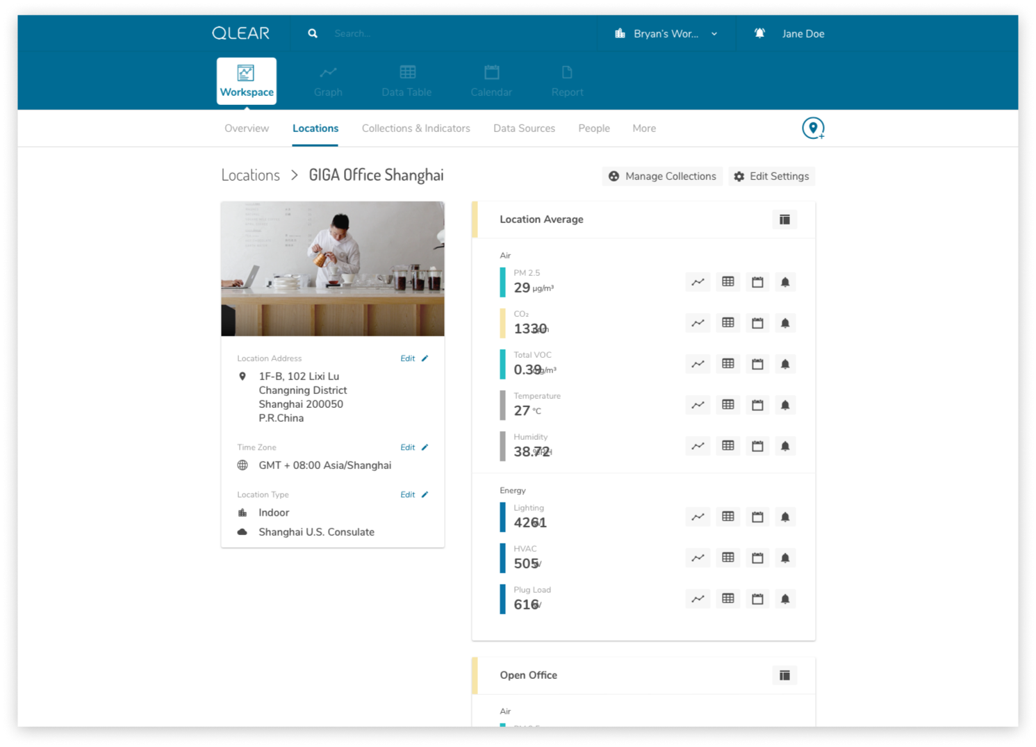
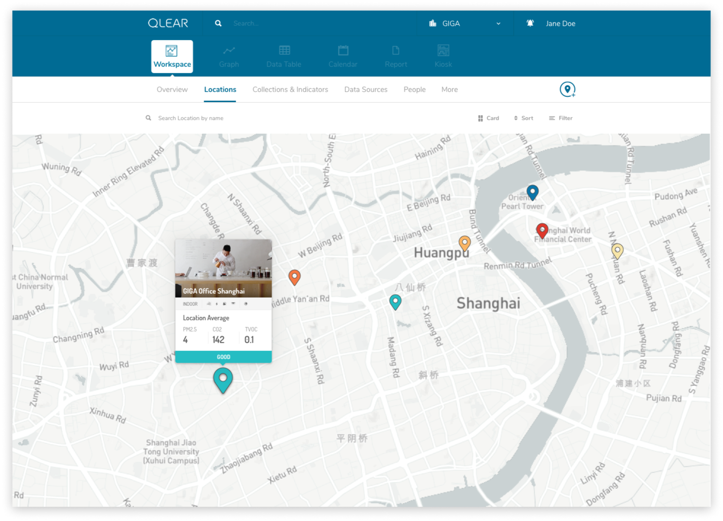
Check out some featured mockups showcasing early renditions of the tool-based paradigm.
BRANDING DESIGN
Finally, let’s briefly explore the branding.
Understanding the company’s roadmap, goals, target audience and domain, it was important that QLEAR invoked the appropriate emotions that would instill confidence and stability, while maintaining an aura of friendliness and approachability. Using myself as an example, I joined this company not knowing anything about environmental sustainability. One of our company’s roadmaps was to begin balancing out our target audience to include direct relationships with end-users, and not solely relying on service providers. This meant that our website needed to communicate to consumers at large, and not just folks that were already domain experts (or familiar with the subject, at the very least).
Moodboard
I largely stuck to the same color palette, but opting to use a lot of white to draw parallels between the concept of ‘clean’ environments (as opposed to blue, which many can draw parallels with ‘sky’ or ‘air’)
Fonts
With typefaces, I wanted to strike a balance between forward-thinking and approachability. The idea was to use the stronger font for headers/titles, and a sans-serif font with round edges to improve readability and approachability.
I leveraged Frontify as our central library for all design related materials including typography rules, style guides, fonts and color usage, visual and photography guidance, logo assets, and more.
Colors
The color scheme was mostly kept in order to maintain consistency around the current branding for our existing users.
RETROSPECT
As the only Product Designer on this small startup, the one year I spent at QLEAR was an extremely valuable time for me - lots of self learning, experimenting, and a lot of freedom in making executive design decisions.
Key Takeaways
Because we were a startup, and established very close relationships with our earlybird users, it was extremely convenient and helpful being able to put early designs in front of them for testing and feedback. They were paramount in helping perfect the product.
Particularly because we were introducing such a major shift in the product model, further testing would be necessary. I left the team right as we were building out the enhanced CRUD model, and I was only able to provide early mockups and guidance for the new visual design language.
When faced with language barriers, face-to-face communication is key. Our development team were all Chinese speakers with limited English, while Product and Business teams were English speakers with limited Chinese.
If you’d like to learn more about QLEAR, I published an additional case study describing the design process of the corporate website.
As of this publication, some select features have been rolled out in phases. A public version of QLEAR is available for viewing. Thanks for reading!


